
Accordion Plus Component
A new accordion component with animated plus/minus icons that morph smoothly when expanding and collapsing!
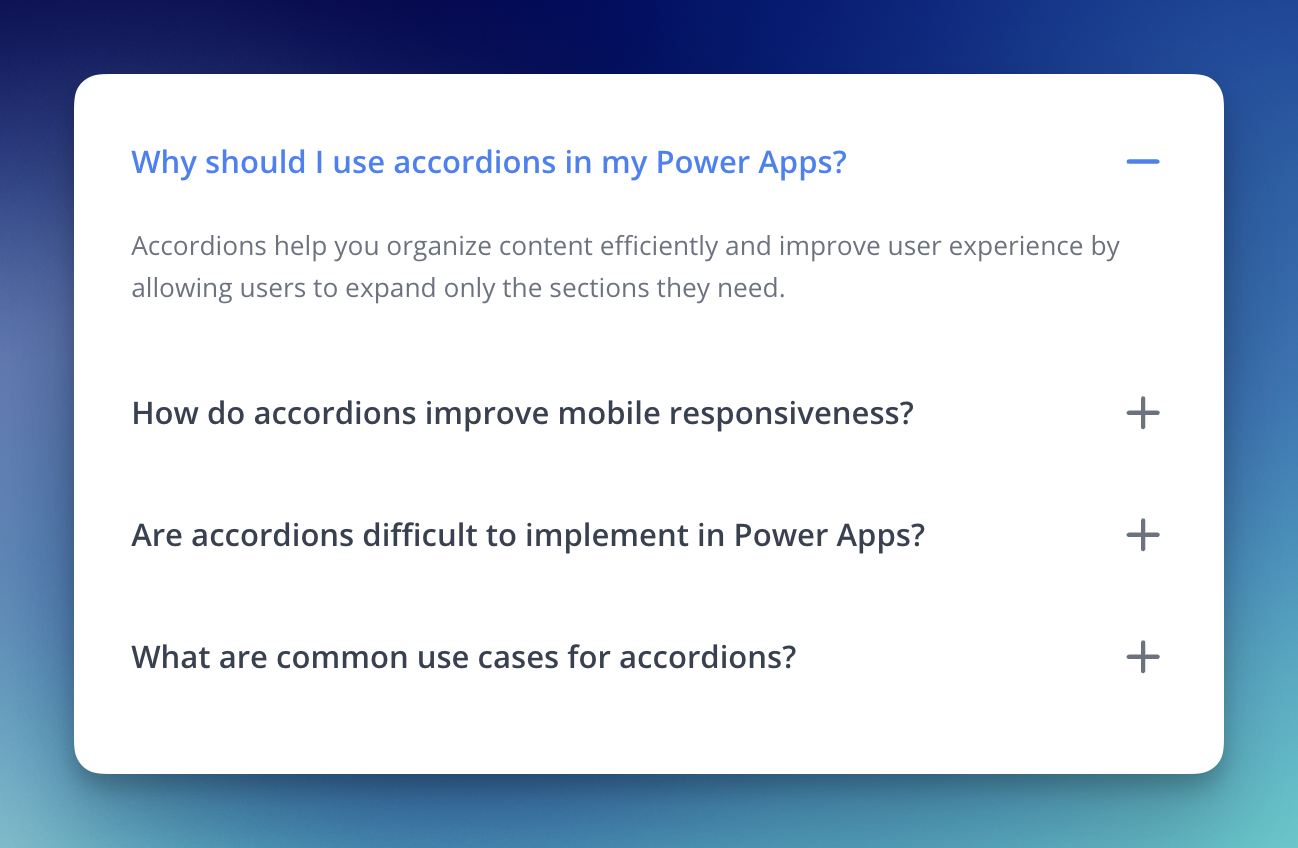
Perfect for FAQs, help documentation, settings menus, and any scenario where you need to organize content efficiently. The animated icons provide clear visual feedback and make the interaction feel more polished.
Changelog Page
I've added a dedicated Changelog page where you can see all updates to PowerLibs in one place!

Now you can:
- Stay informed about all new components and features
- Browse past updates to see what you might have missed
- Access directly from the user menu or visit powerlibs.com/changelog
I feel like this will make it easier to stay updated on all new components and features.
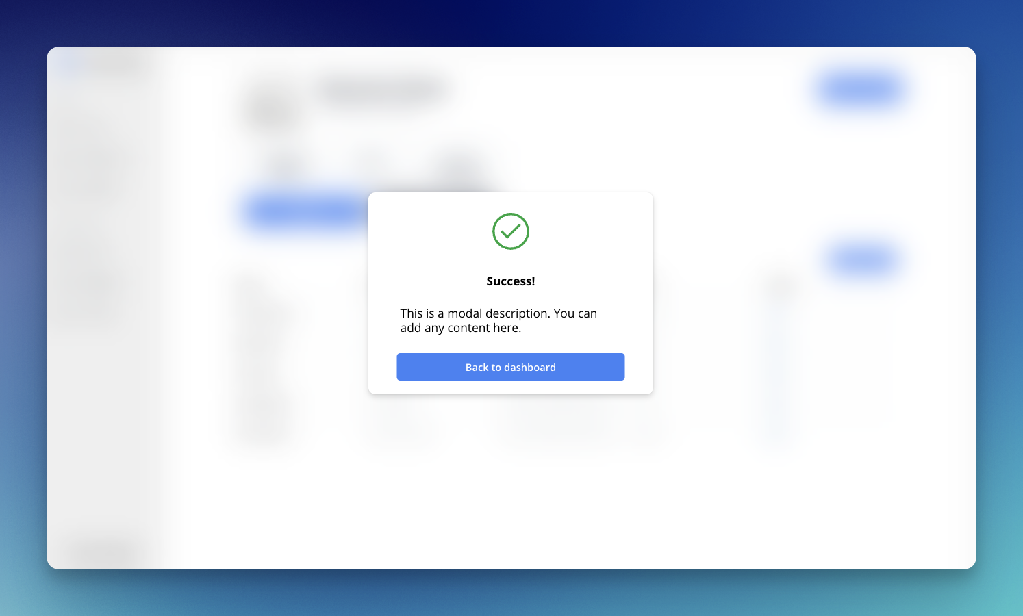
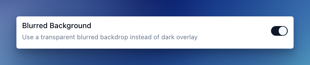
Blurred Background for Modals
All modal components now have a new background style option! You can choose between the traditional dark overlay or a modern blurred transparent backdrop.
How to Use:
Simply toggle the "Blurred Background" option in your modal settings to switch between styles.
Available For:
- Confirmation Modal
- Warning Modal V2
- Success Modal
- Basic Modal
The blurred effect creates a modern glassmorphism look that works great for apps with background content you want to keep partially visible.