
Every component gets its own page
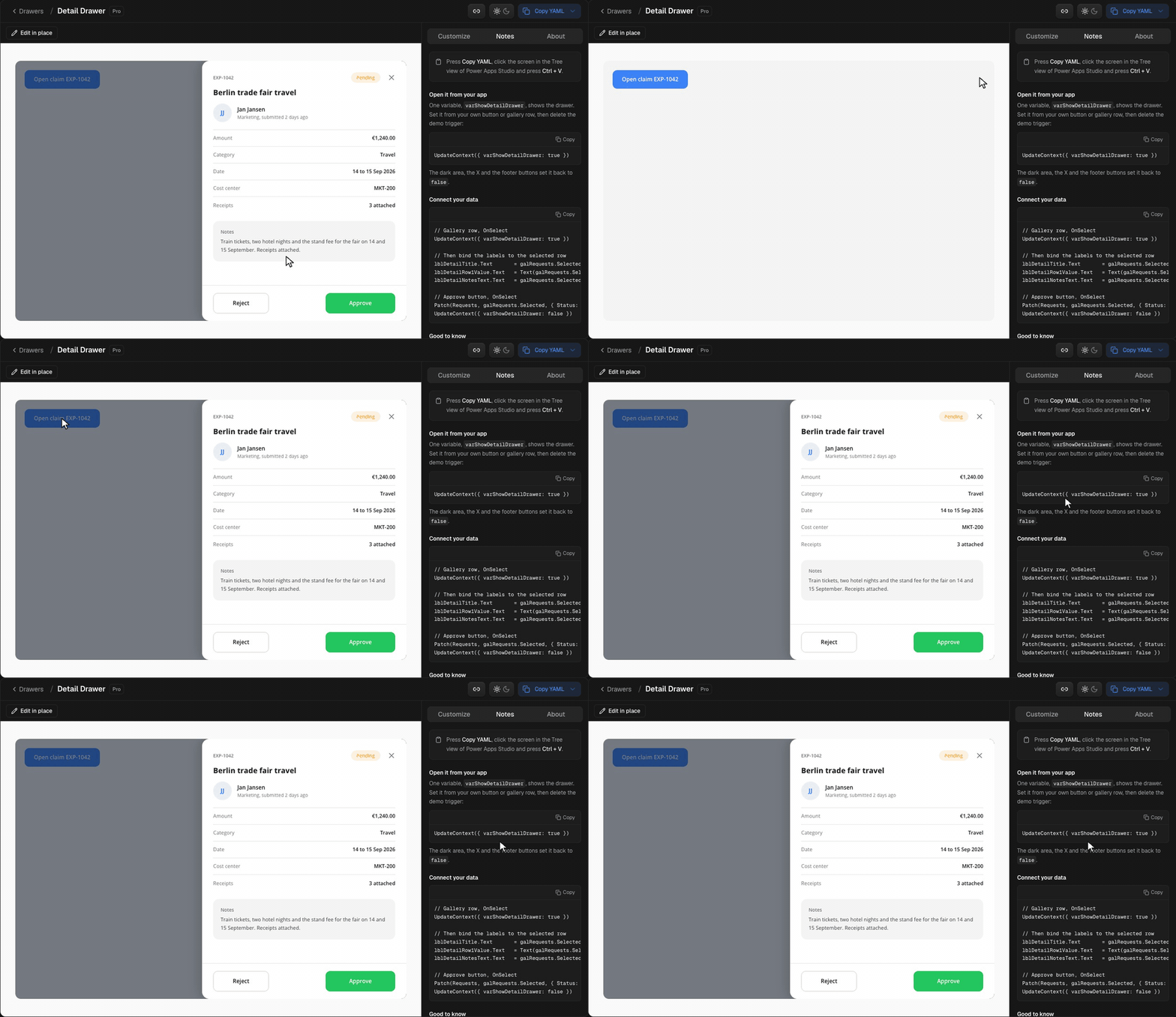
Each of the 173 components has its own page, like the Detail Drawer: a big preview you can click through, Customize next to it, and short notes on wiring it into your app. Every page has its own link, so you can send someone exactly the component you mean.
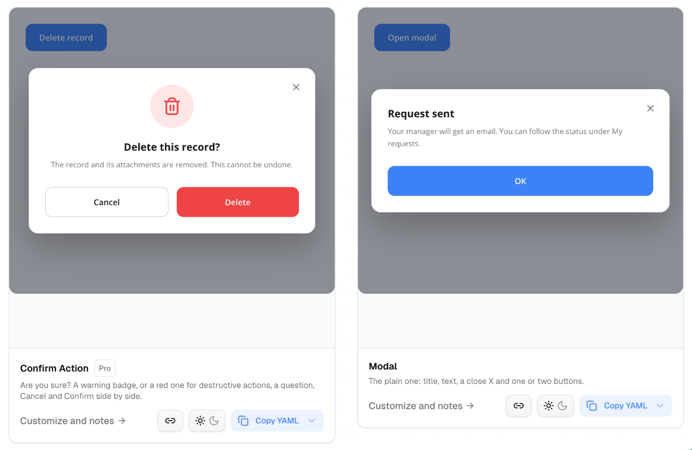
On the category pages, Copy YAML and light or dark sit right on each card. Free components are marked Free.
Click to edit
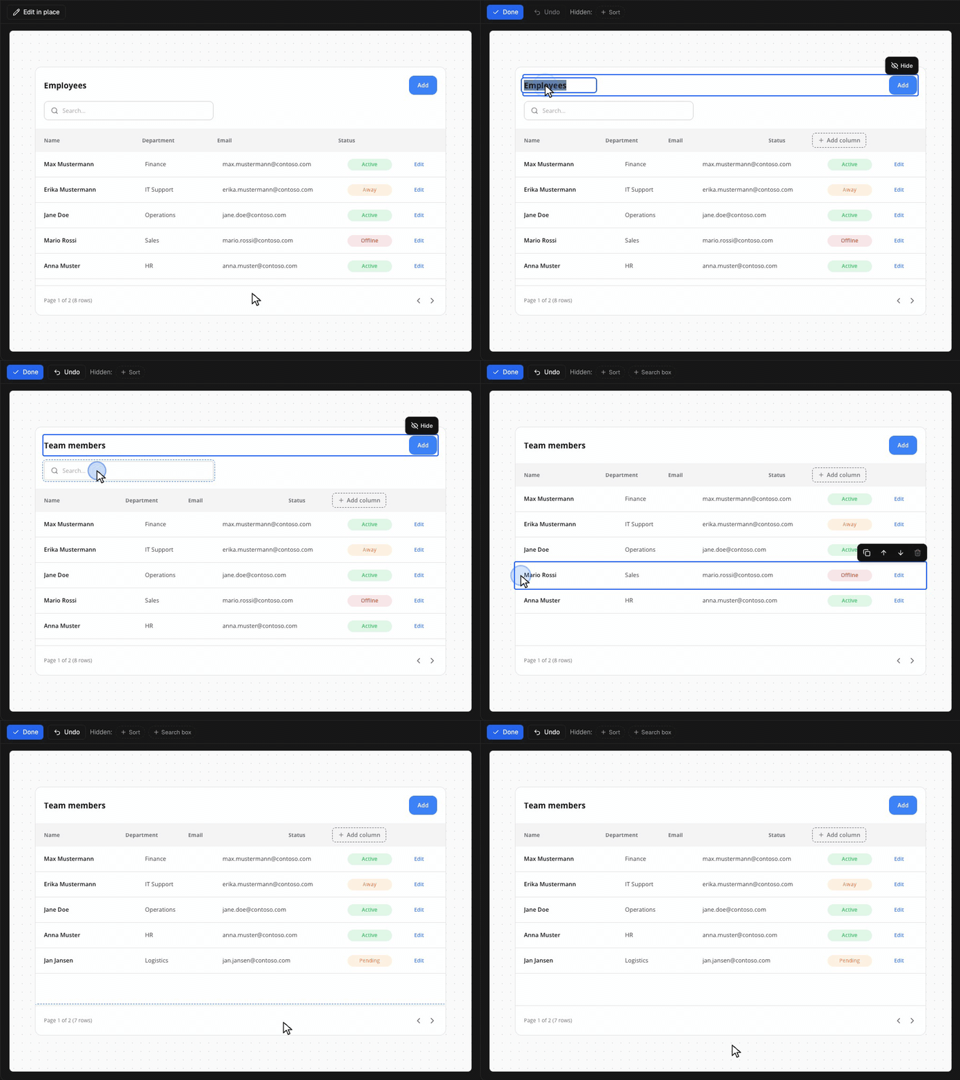
Turn on Edit in place above the preview and change the component right there:
- Click a text and type over it.
- Hide the parts you do not need.
- Add, duplicate, move or delete rows.
- Undo with Cmd+Z.
The YAML follows every change.
Full apps
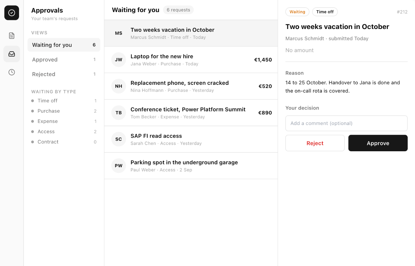
- Approvals saves to your SharePoint list and mails the approver and the requester. No Power Automate needed. No list yet? Download the CSV and create the list from it.
- A new shadcn style for every full app: white, calm, black buttons, in light and dark.
- Setup in four steps you can tick off on each app page.
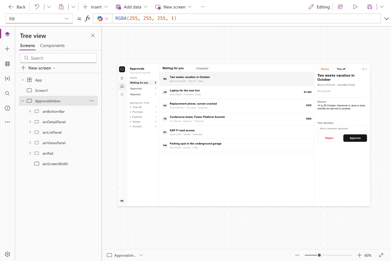
Galleries on your SharePoint list
List Gallery, Card List, Card Grid, Data Table and Sortable Data Table read your SharePoint list directly. Pick the column for each field and the YAML does the rest, with search and sorting that work on large lists.
36,000 icons
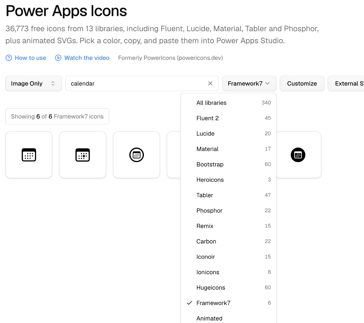
Icons now has 36,773 icons from 13 libraries, free to use without a credit line. Copied icons carry a label for screen readers, so App Checker stays quiet.
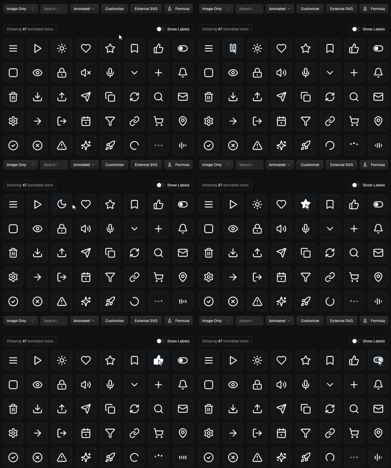
47 animated icons, like Menu to Close, Like, Send and Loading, take your color.
New components
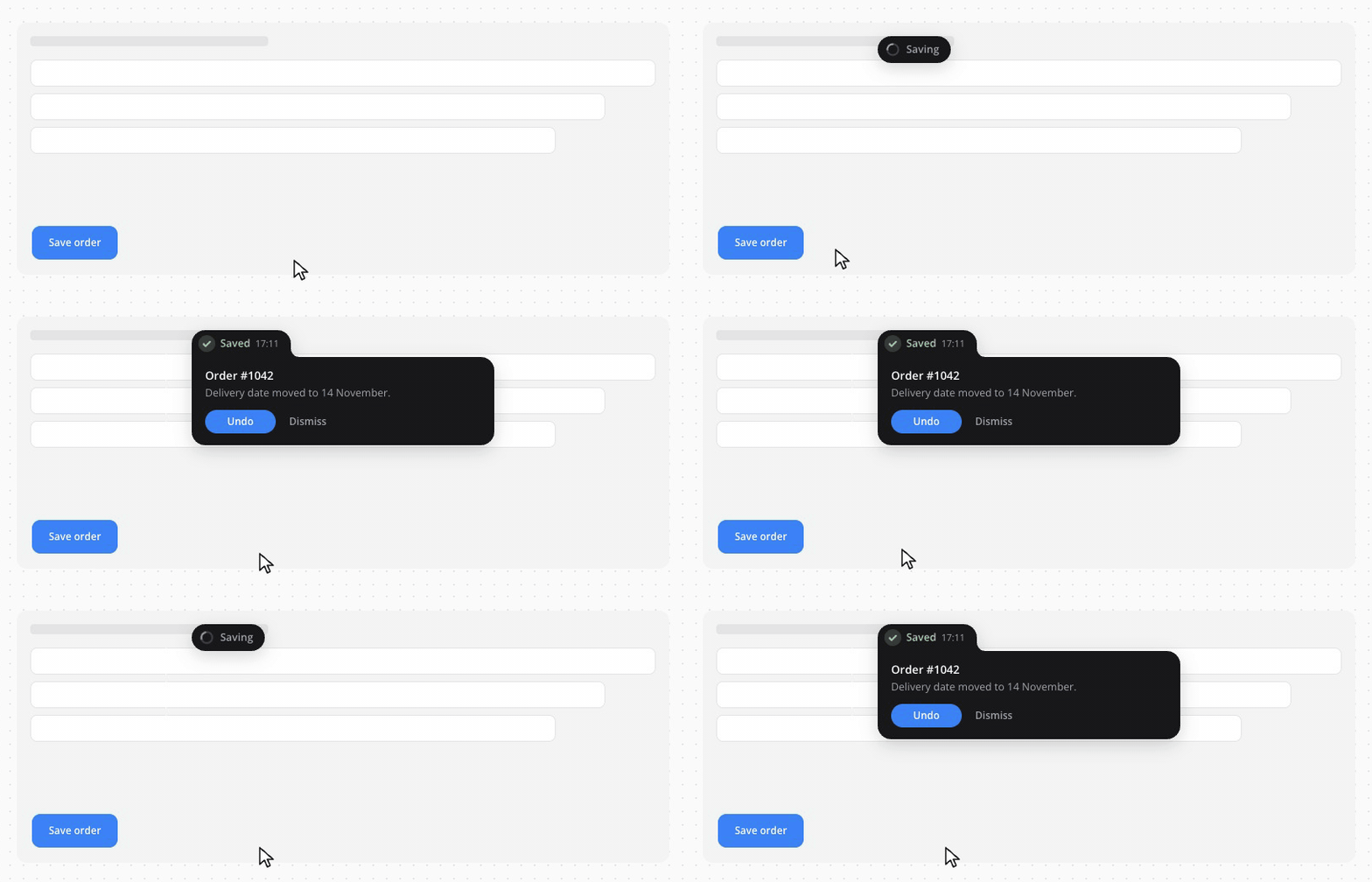
- Save toasts that show Saving, then Saved or the real error from your Patch.
- Badges in seven status colors.
- Calendars that follow your brand color.
- Text fields with help text and a required state.
Fixes
Every component was pasted into Studio and checked. Fixed:
- A quote in a title or label no longer breaks the formula.
- Rating, Slider, Signature Pad and the Modern pickers paste without errors.
- Titles are readable on dark bars in dark mode.
- Animations play smoothly in Studio.
- Renaming a Data Table column keeps its cells.
Also new
- Connect the MCP server to Claude, VS Code or Cursor with one click.