
Eleven new components
Eight new form fields, including radio and checkbox groups, plus a new Data Display category for dashboards.
Form fields that validate themselves
Input Fields goes from 2 to 10. Every field is the same three-part shape, a label above, the input, and a helper line below, so you can drop several into one form and they line up without adjustment.
The helper line does double duty. It shows guidance while the value is fine and turns into a red error message when it is not, rather than appearing from nowhere, so your form never changes height as somebody types.
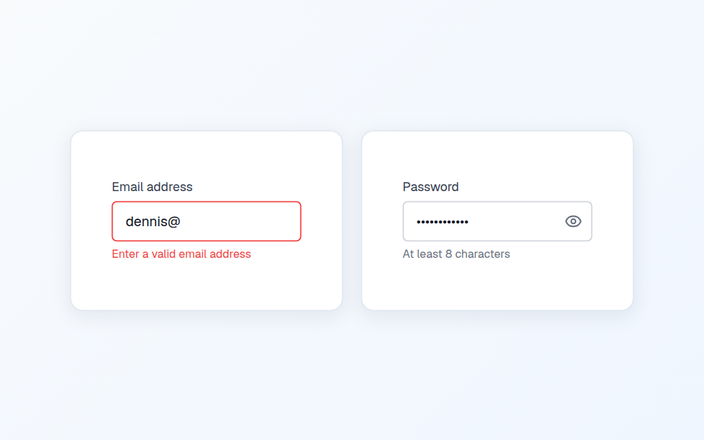
The Email field checks the address as it is typed using Match.Email, and Phone flags anything too short or containing characters a number would not. Password masks the value with a show and hide toggle, so people can check what they typed before submitting.
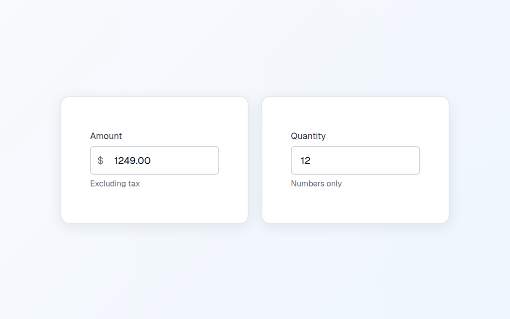
Currency puts the symbol inside the box and restricts input to numbers. Number does the same without the symbol, for quantities and counts.
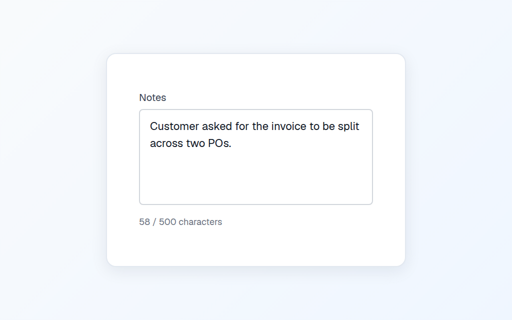
Notes is a multi-line field with a live character counter, so users know how much room is left instead of discovering the limit by hitting it.
Radio and checkbox groups
Two ways to ask someone to choose, both working straight out of the paste.
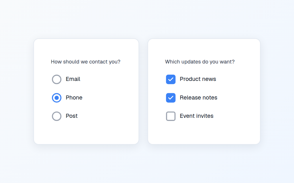
Radio Group holds one answer in a context variable. Checkbox Group collects several into a collection you can read straight into a Patch. Both work with no data source, so you can paste one and it does something immediately, and both come with the formula you need to set or clear them on OnVisible.
Options are edited as a list in Settings rather than a comma-separated string, because option labels routinely contain commas.
A new Data Display category
The other half of what Power Apps is for. Everything a dashboard opens with, in a new Data Display category.
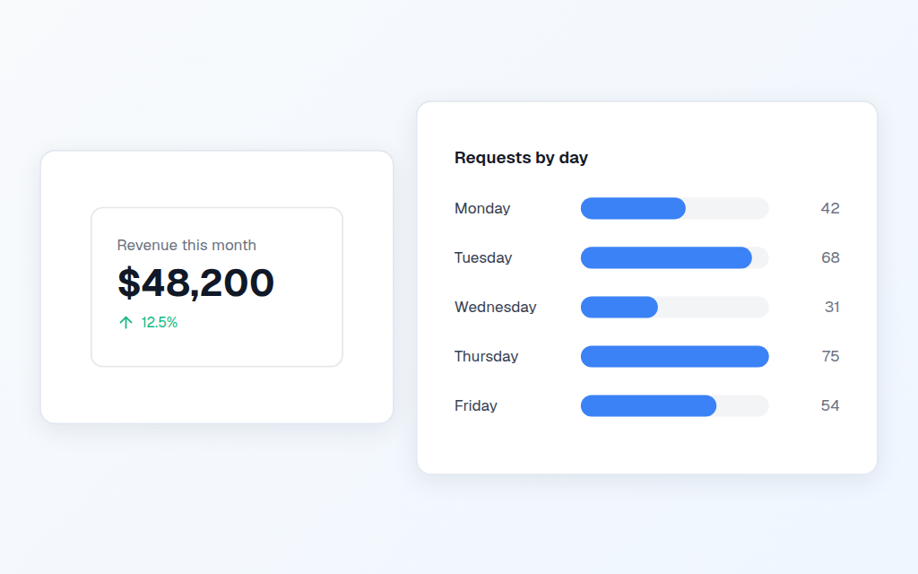
KPI Tile is a caption, one big number and a change indicator. The up and down colours stay green and red rather than following your brand colour, because a revenue drop rendered in company blue tells the reader nothing.
Bar Chart is built from real controls instead of an image. That matters more than it sounds: because the bars are actual shapes rather than an SVG string, they follow your app's colours and the labels stay editable in Studio. Bars are scaled to the largest value, so there is no maximum to configure.
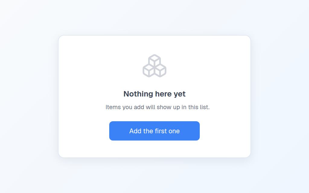
Empty State is the one nobody builds. When a gallery has nothing in it, users see a blank rectangle and assume your app is broken. This tells them the list is simply empty and gives them something to do about it. It pastes visible so you can position it, then you point its Visible at your own gallery in Settings.