
9. September 2026
46 new components, an Approvals app and a Helpdesk app
The library went from 142 to 182 components. I rebuilt twelve families on shared kits along the way, so buttons, tabs, toggles, modals, cards and drawers now share sizes, spacing and behaviour.
Full apps
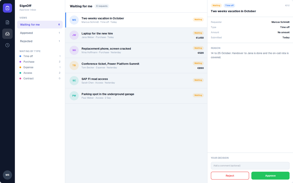
- Approvals App: three screens, My Requests, Approver Inbox and History. Also built to work on phones. Take the tour.
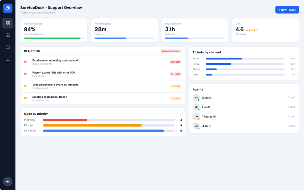
- Helpdesk App: Support Overview with SLA, channels and agents, and a Ticket Inbox. Take the tour.
- I gave Project Management and Inventory Manager a dark palette.
- What's on this screen: the Project Management and Approvals screens, the eight kit cards and the drawers now have switches that turn parts off before you copy. Fewer controls to delete in Studio.
- Every full app has a tour page now, linked from the new Full Apps section on the landing page.
Buttons
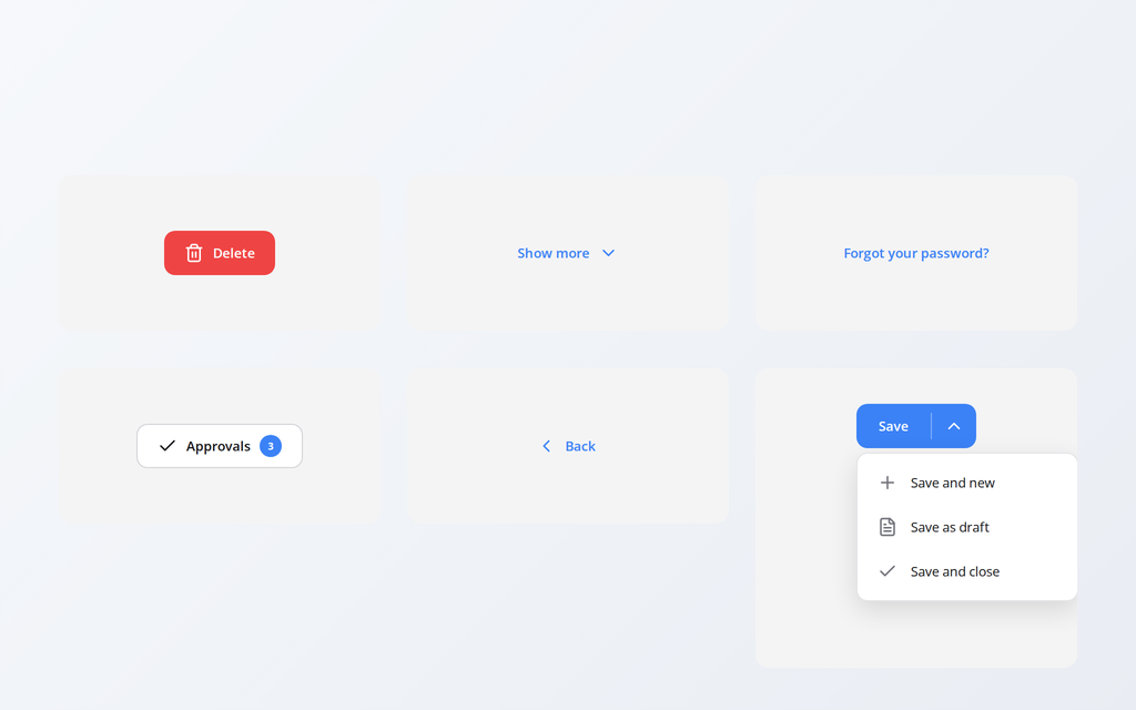
- Danger Button: red, for delete and remove. Filled or outlined.
- Ghost Button: brand-coloured text on nothing, a tint on hover. For the third action in a row.
- Link Button: a text that works like a link, for Forgot password and View all.
- Split Button: the main action plus a chevron that opens related actions.
- Badge Button: a button with a count in a pill: Approvals 3.
- Back Button: a chevron and Back that calls Back().
- Action Bar: Cancel and Save pinned to the bottom of an edit screen, with an unsaved changes line.
Cards
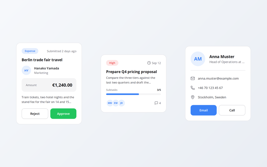
- Approval Card: one item in an approver queue, with Reject and Approve.
- Task Card: priority, due date, subtask progress, assignees and a comment count.
- Contact Card: name, role, email, phone and location, with Email and Call buttons.
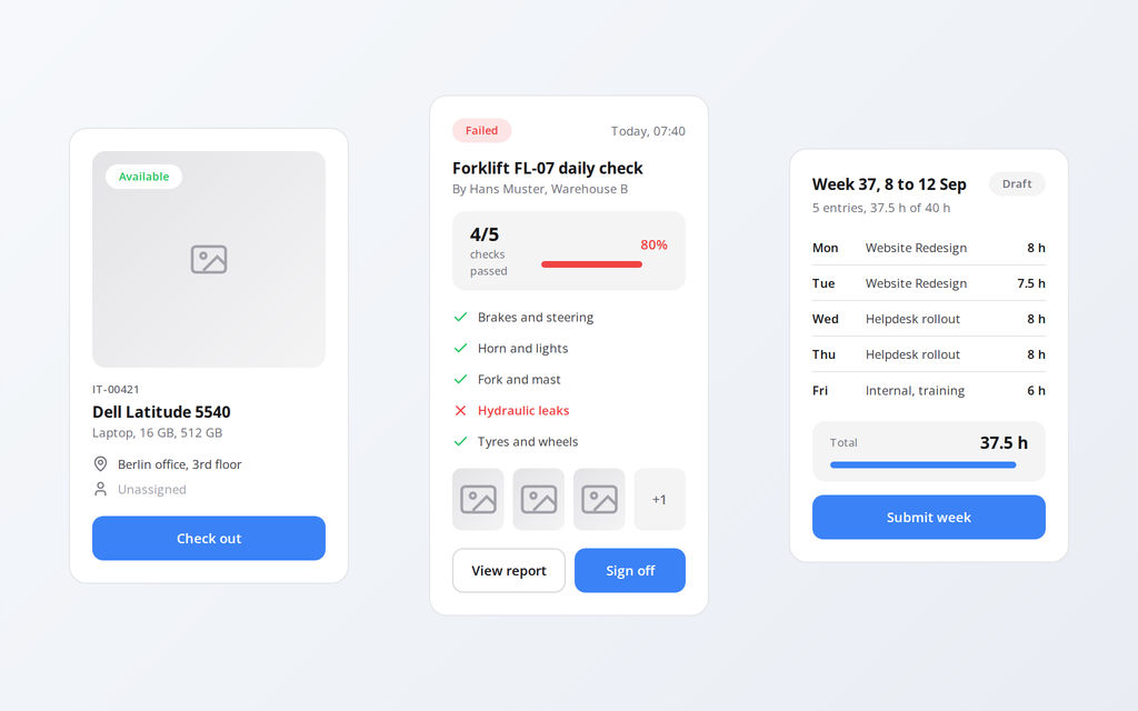
- Asset Card: one item from an inventory or IT register, with Check out and Check in.
- Inspection Card: pass or fail, score bar, checklist, photos, View report and Sign off.
- Timesheet Card: one person's week with a total against target and Submit.
Modals
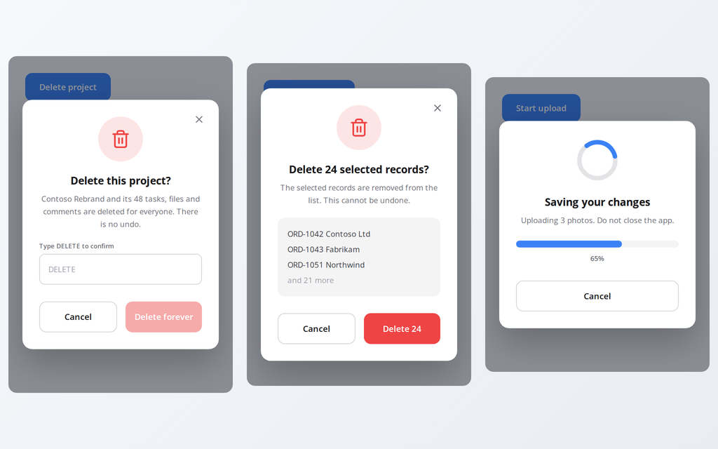
- Type to Confirm Modal: the red button stays disabled until the user types the word.
- Bulk Action Modal: Delete 24 selected records? The count in the title and the button.
- Progress Modal: a spinning ring, an optional bar driven by a percent variable, optional Cancel.
- Feedback Rating Modal: five stars and a comment, stored in two variables.
- Access Denied Modal: why the user cannot go on and who can help.
Accordions
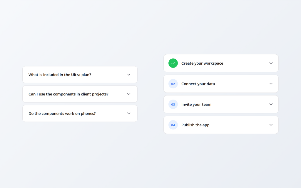
- Bordered Accordion: each row a card, the open one takes the brand colour.
- Steps Accordion: numbered rows for onboarding, finished steps show a green check.
- Flush Accordion: dividers only, several rows open at once, Expand all and Collapse all.
- Settings Accordion: icon, title, one-line subtitle and a chevron.
App shells
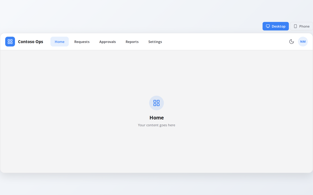
- Top Nav App Shell: brand, navigation as tabs, theme switch and user in one header. Phone gets a bottom tab bar.
- Portal App Shell: for self-service portals, with a page band and a centred column.
- Split View App Shell: list on the left, detail on the right. On a phone a row opens the detail with a back arrow.
- Mobile App Shell: for frontline apps on a phone, with a bottom tab bar that is always there.
All four switch between light and dark. I rebuilt the six existing shells on the same kit.
Drawers
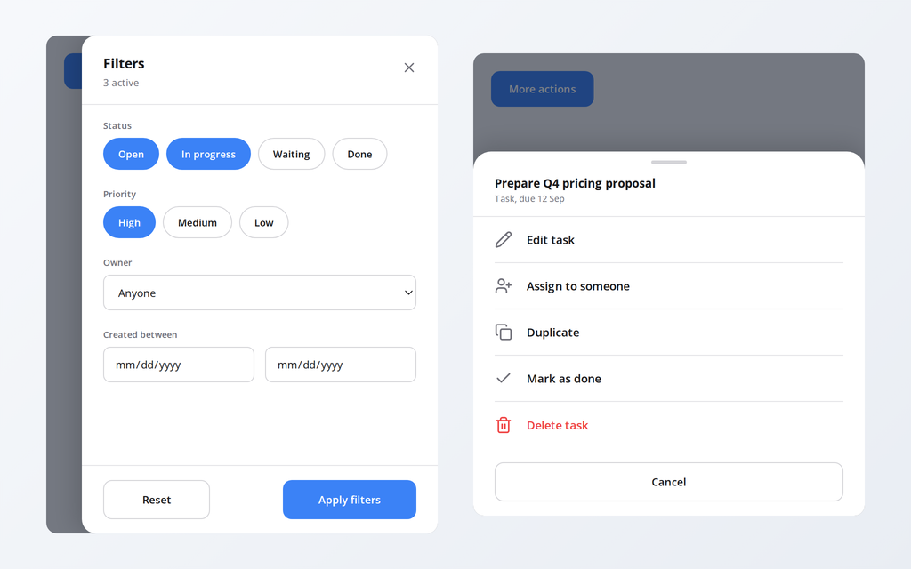
- Filter Drawer: status and priority chips, owner, date range, Reset and Apply. The chosen chips live in collections your Filter formula reads.
- Action Sheet: the phone way to offer actions on a record, the destructive one in red.
- Detail Drawer: the selected record in a side panel with two decision buttons.
- Comments Drawer: the conversation on a record, with a composer.
Toggles
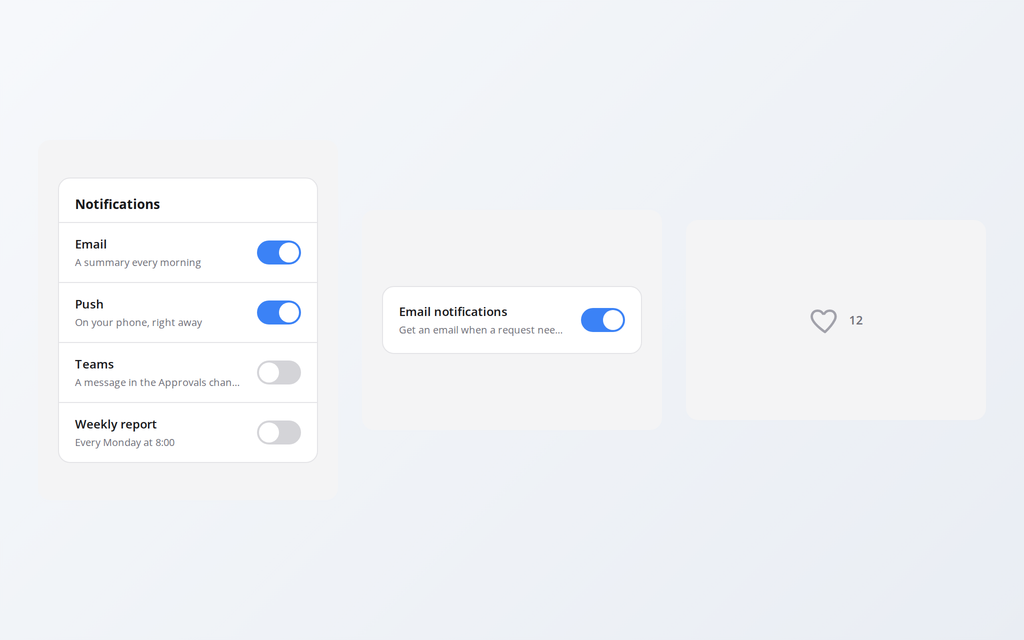
- Toggle List: a card with a heading and several settings rows, each with its own switch.
- Settings Row Toggle: title, explanation and the switch. The whole row is the tap target.
- Favorite Toggle: a heart, star or bookmark that fills with a small pop.
I rebuilt the existing toggles with a sliding knob.
Tabs
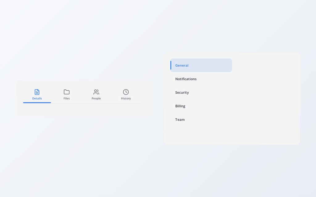
- Icon Tabs: an icon above a short label, the underline slides. Up to five.
- Vertical Tabs: a list down the left with a highlight that slides. Up to eight.
Galleries
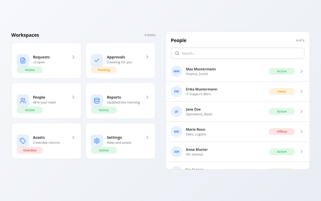
- Card Grid: tiles that reflow with the screen, three across on a desktop, one on a phone.
- List Gallery: the row list every business app has, with search, status pill and chevron.
Speed dial
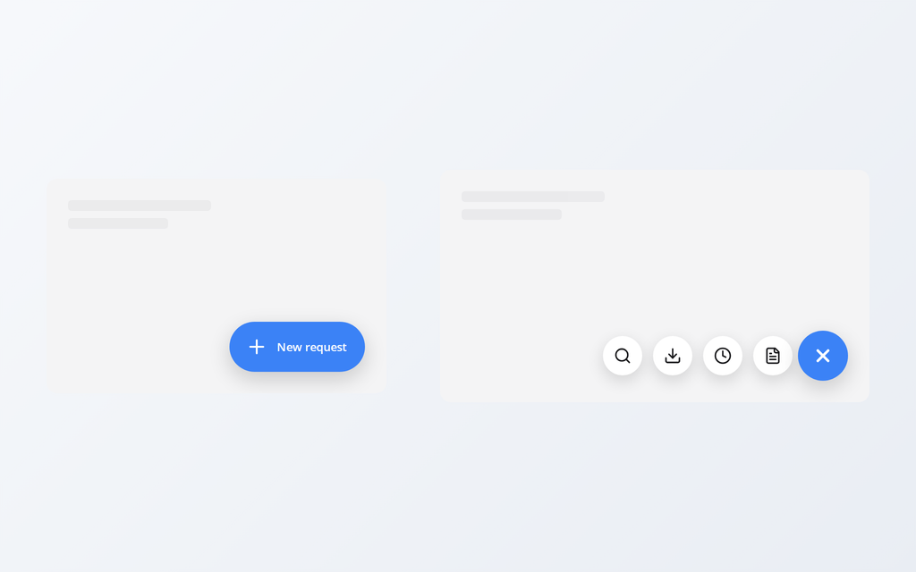
- Floating Action Button (free): one action in the corner, round or extended, optional badge.
- Horizontal Speed Dial: the actions fan out to the left, for wide screens.
Animations
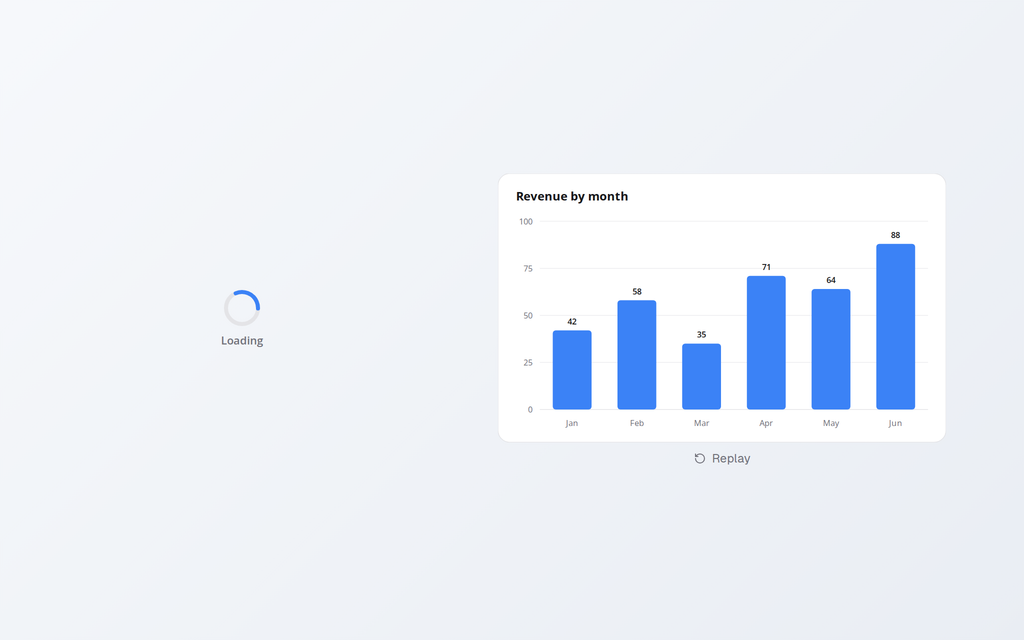
- Loading Spinner: ring, dots or bars in one SVG image, with an optional caption.
- Animated Bar Chart: bars grow from the baseline one after another.
- Success Check: the tick that draws itself after a save.
- Staggered Fade-in: a list whose rows appear one after another.
I moved everything that moves to SVG, so the animations are smooth in Studio.
Fixed
- Top Nav and Portal shells would not paste (duplicate control names). Fixed.
- The tab indicator landed short of the last tab. Fixed.
- Searchable Lookup and People Picker work on paste again, with sample data.