
3. September 2026
22 new components and a phone-ready Project Management app
Uploads
A new Uploads category. Every component wraps the real Power Apps control, so uploading works exactly as before and only the styling changes.
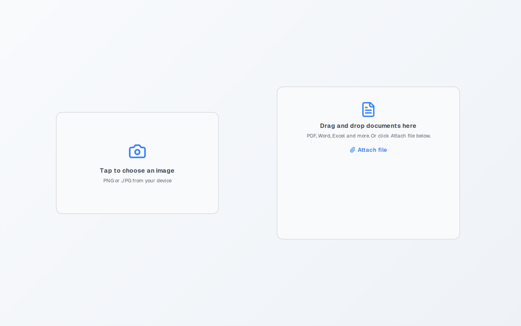
- Photo Upload: the Add picture control in a card. Tap, pick an image, see the preview.
- Document Upload: the Attachments control, standalone, no form required. Drag and drop or click Attach file. Also as Compact, Tinted and Minimal.
- Signature Pad: the Pen Input control with a Clear button. The signature is read as an image for Patch or a flow.
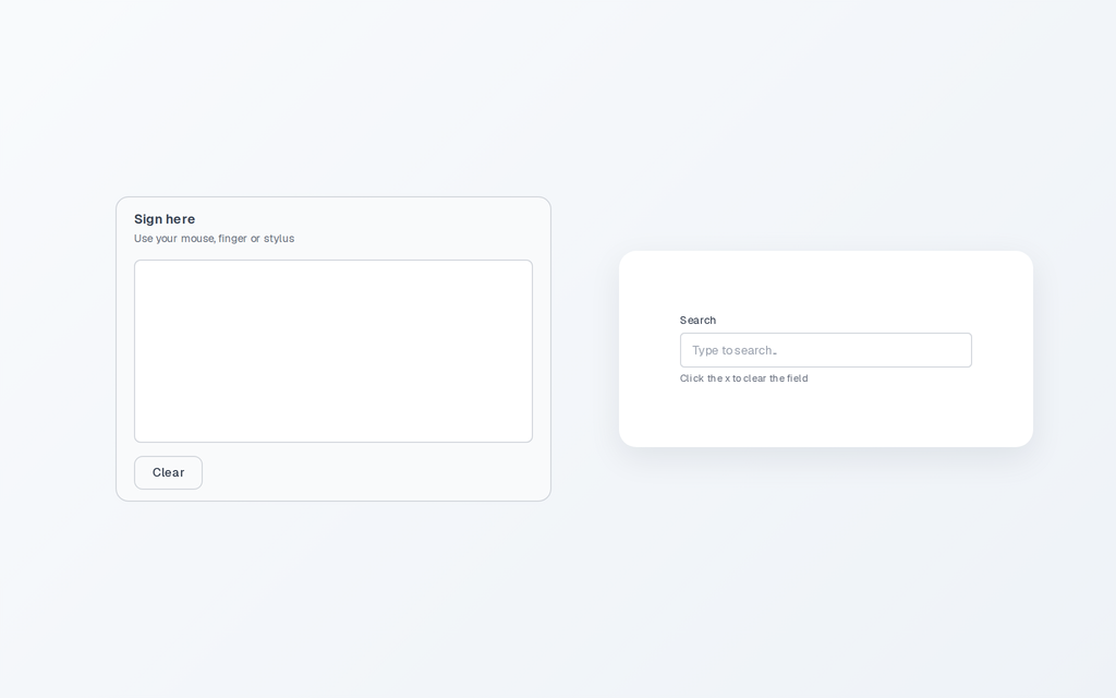
- Clearable Input: a text field with an x that empties it. The x only shows while the field has text.
Ratings and sliders
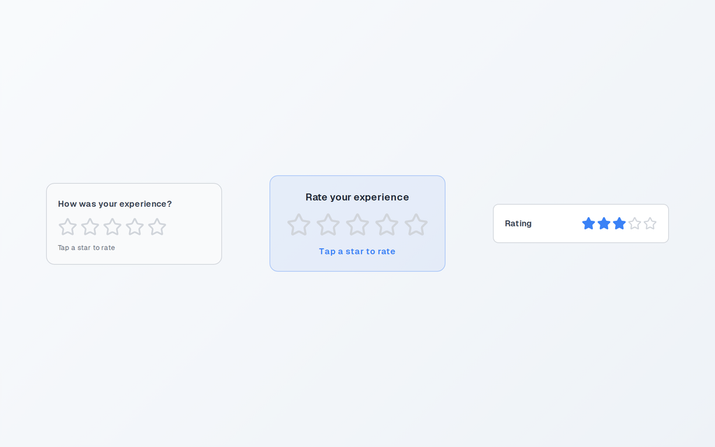
- Rating: brand-coloured stars with a question and a live value line.
- Rating Feedback Card: the sentiment line changes as the user rates, from Poor to Excellent.
- Rating Compact: label left, stars right, for a column of fields or a score per row.
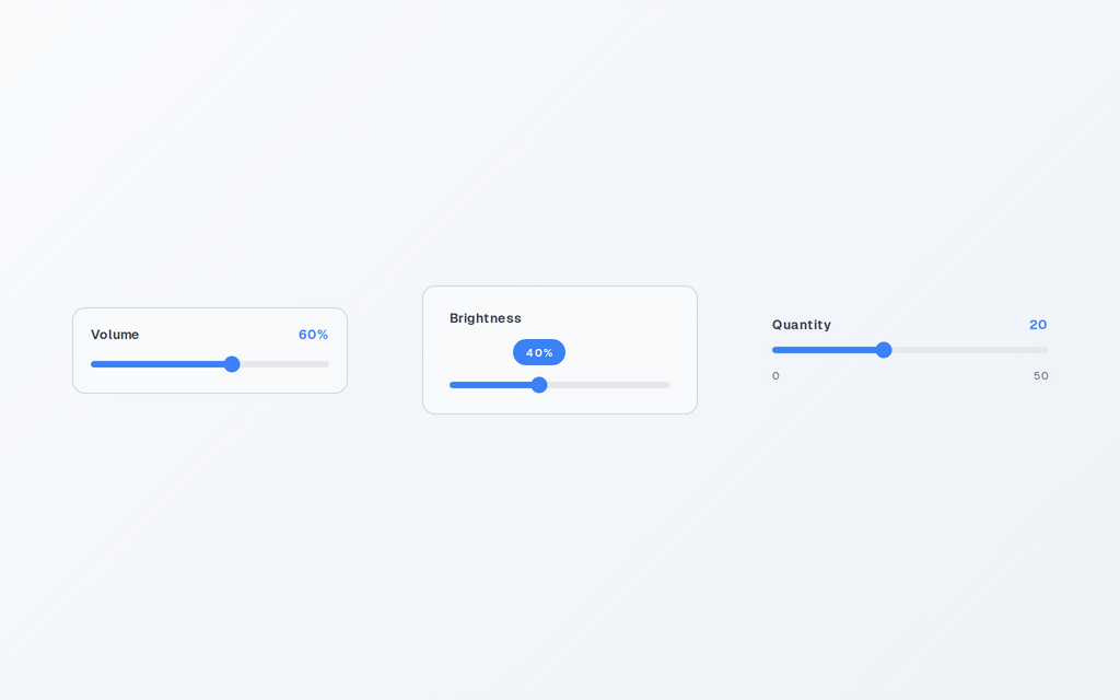
- Slider: brand-coloured track, label, live value with optional suffix.
- Slider with Value Bubble: a pill above the handle follows it while dragging.
- Slider Minimal: no card, min and max captions under the rail.
Avatars
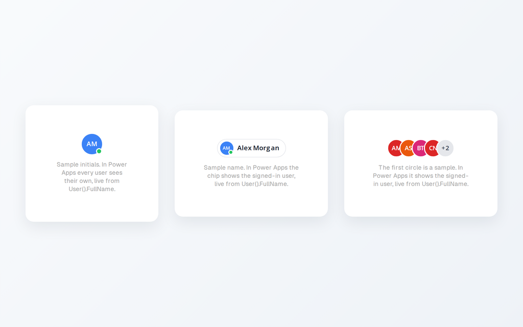
- User Avatar: initials of the signed-in user from User().FullName, no connector. Three styles, three sizes, optional presence dot.
- User Chip: avatar and name in one pill, for headers and "assigned to" rows.
- Avatar Group: overlapping initials for assignee lists, overflow collapses into +N.
Loading skeletons

Skeleton Card, Skeleton List and Skeleton Text are pulsing placeholders shown while a gallery or paragraph loads.
Carousels
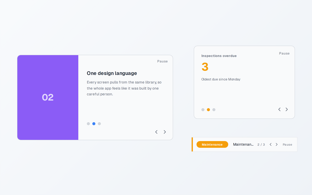
- Gallery Carousel: auto-advancing slides with dots, arrows and a pause toggle. Slides, colours and speed in Settings.
- KPI Spotlight Carousel: cycles headline metrics one at a time in the space of one tile.
- Announcement Bar Carousel: a slim bar for internal announcements with a category chip and a counter.
Project Management app
If you pasted any of the three screens before today, copy the YAML again.
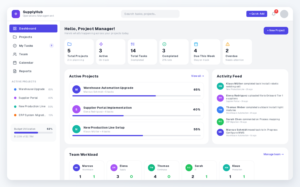
- All three screens resize on phones. Below 640 pixels: phone layout with hamburger menu. Up to 1023: tablet layout. From 1024: desktop sidebar. In Studio, Settings, Display, set App layout to Responsive; the instructions on each screen explain this.
- Dashboard: the stats row and the team row show whole cards per swipe on phones.
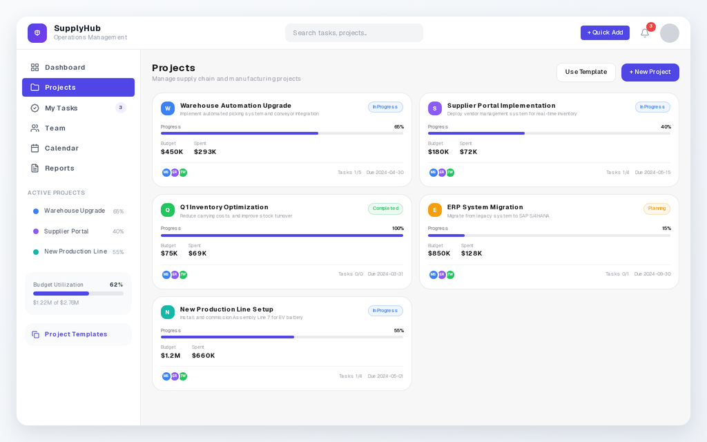
- Projects: the card list scrolls, and + New Project opens the dialog.
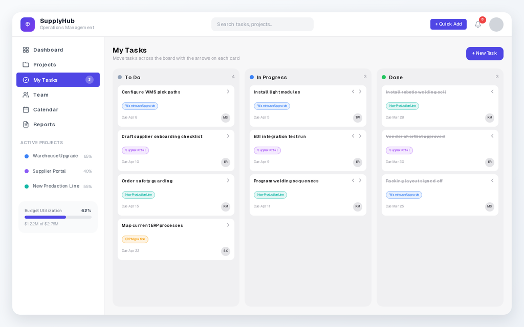
- My Tasks: columns stack on phones. + New Task opens a dialog with task, project, due date, assignee and column. Tap a card title to edit or delete it.
Also
- Focus borders: every control keeps its border thickness on keyboard focus. No more fat default outline on tab.
- Sidebars show the selected item.
- Custom SVG sidebar icons paste correctly.