
How to Add Dark Mode to Power Apps
Dark mode isn't just a nice-to-have anymore - users expect it. In this tutorial, you'll learn how to add a professional dark/light mode toggle to your Power Apps in about 10 minutes.
What you'll build:
- A working dark/light mode toggle
- Colors that automatically switch when the theme changes
- A professional-looking app that respects user preferences
Time needed: ~10 minutes
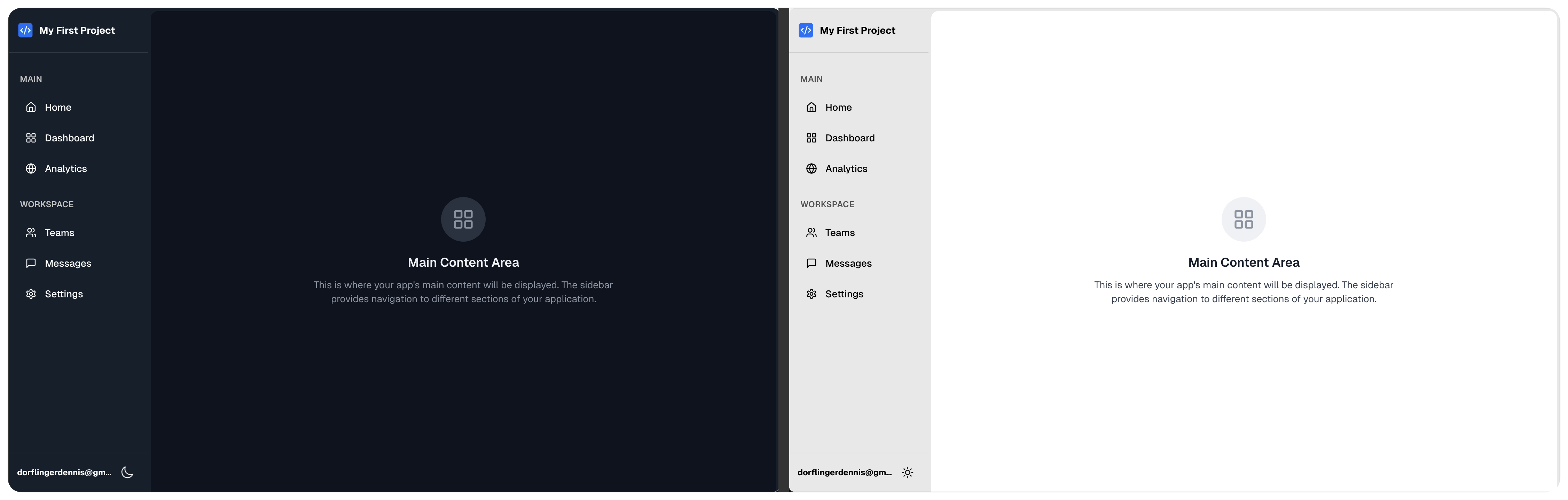
The Quick Way: Use an App Shell
The fastest way to add dark mode is to use a PowerLibs App Shell that has it built-in. These components handle all the complexity for you.
Step 1: Go to App Shells
Visit the App Shells section and pick any shell. Every one of them has a theme switch built in:
- Sidebar App Shell or Collapsible Sidebar App Shell for desktop-first apps
- Top Nav App Shell or Portal App Shell for lighter tools and portals
- Mobile App Shell for phone-first apps, Split View App Shell for list and detail
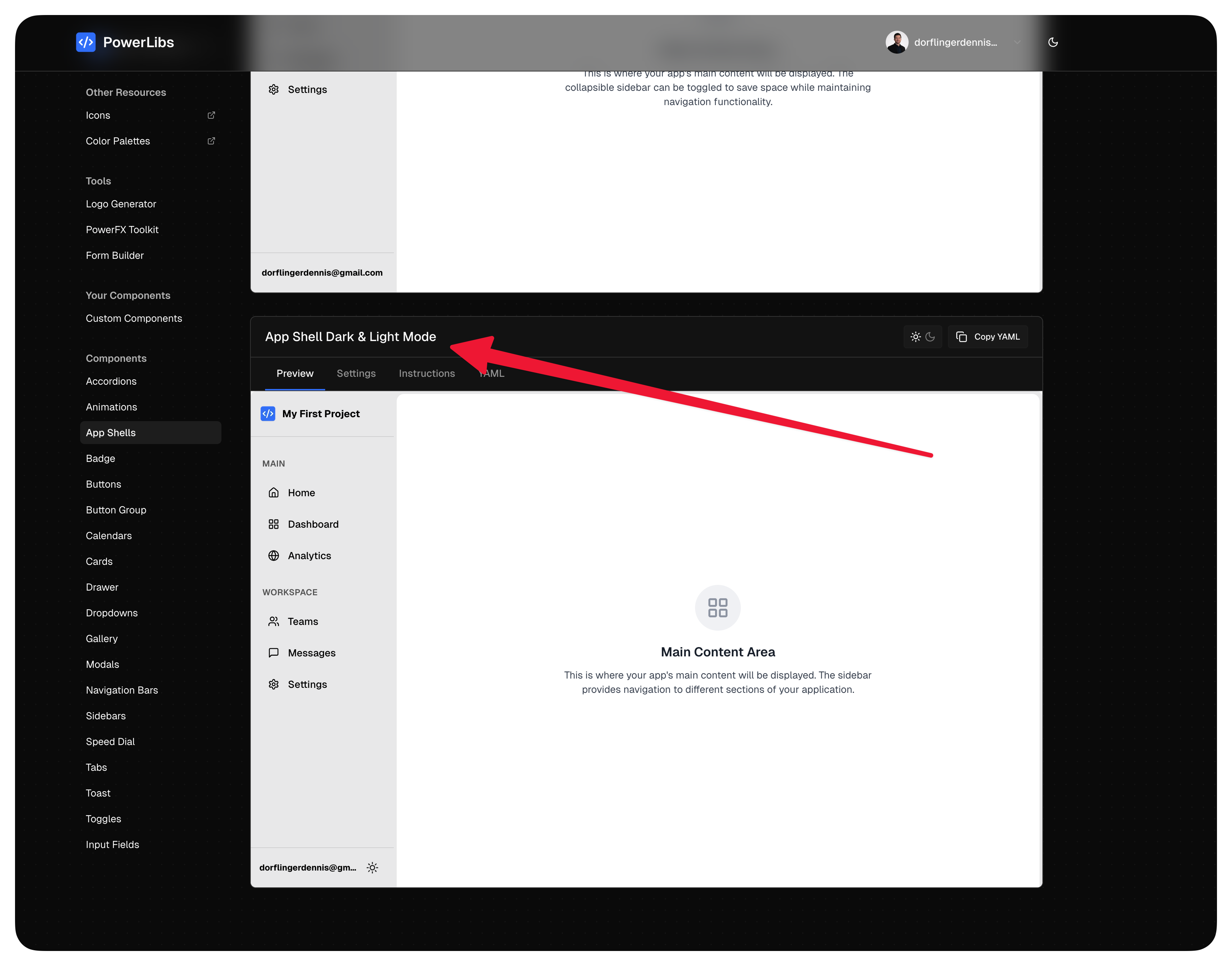
Every shell is responsive: below 768 px the sidebar or tabs hide and a bottom tab bar appears. Nothing to set up for phones.
Step 2: Customize Your Settings
Click on your chosen App Shell and use the Settings tab to configure:
- What's in the frame - keep the Theme switch part on
- App name and logo icon
- Navigation items - label, icon, and an optional screen to navigate to
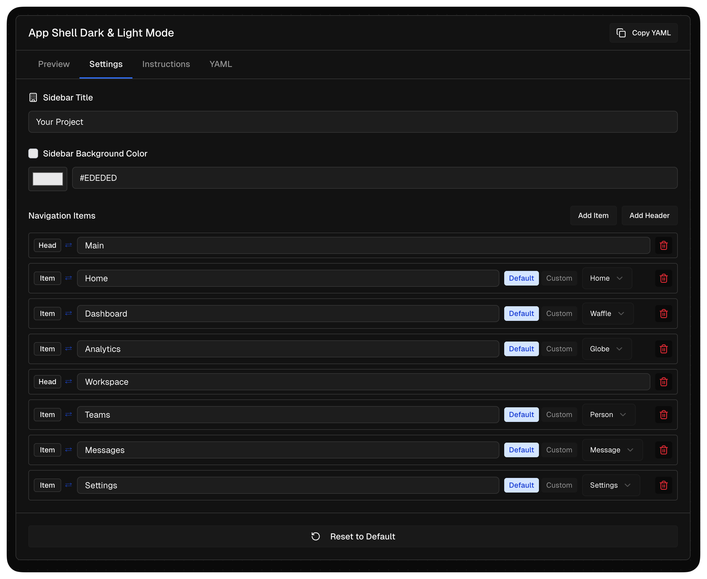
Every surface color in the YAML is a formula such as If(gblShellDark, dark, light), so the whole frame flips when the user taps the sun or moon icon. You do not set two color schemes, and there is no OnStart code to paste.
Step 3: Copy the YAML Code
Switch to the YAML tab and click the copy button. This copies everything you need.
Step 4: Paste into Power Apps
- Open Power Apps Studio
- Right-click in the Tree view panel
- Select "Paste code"
The entire app shell appears with the theme toggle already working.
Step 5: Add the OnStart Code
Switch to the Instructions tab in PowerLibs. You'll see OnStart code that looks like this:
// Add this to App.OnStart
Set(varDarkMode, false);
Set(varBgColor, If(varDarkMode, "#1a1a2e", "#ffffff"));
Set(varTextColor, If(varDarkMode, "#ffffff", "#1a1a2e"));
Set(varSidebarBg, If(varDarkMode, "#16213e", "#f8fafc"));
Copy this code and add it to your App's OnStart property.
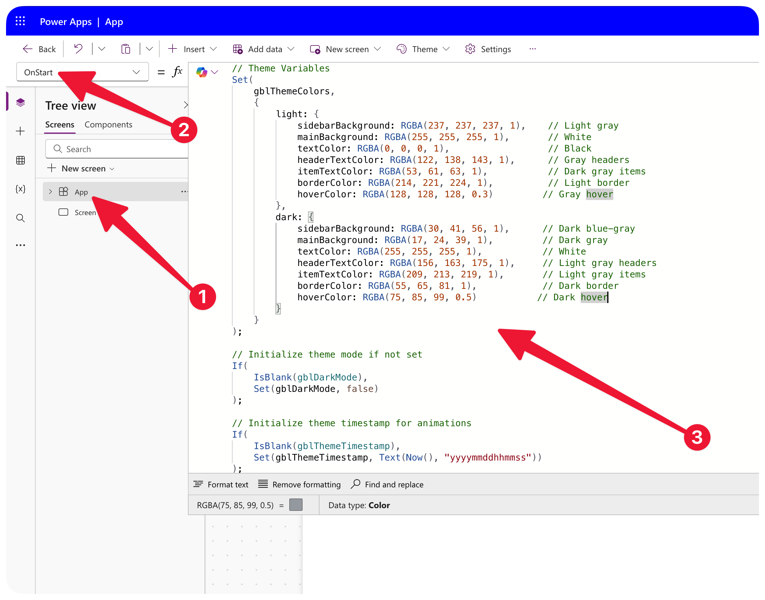
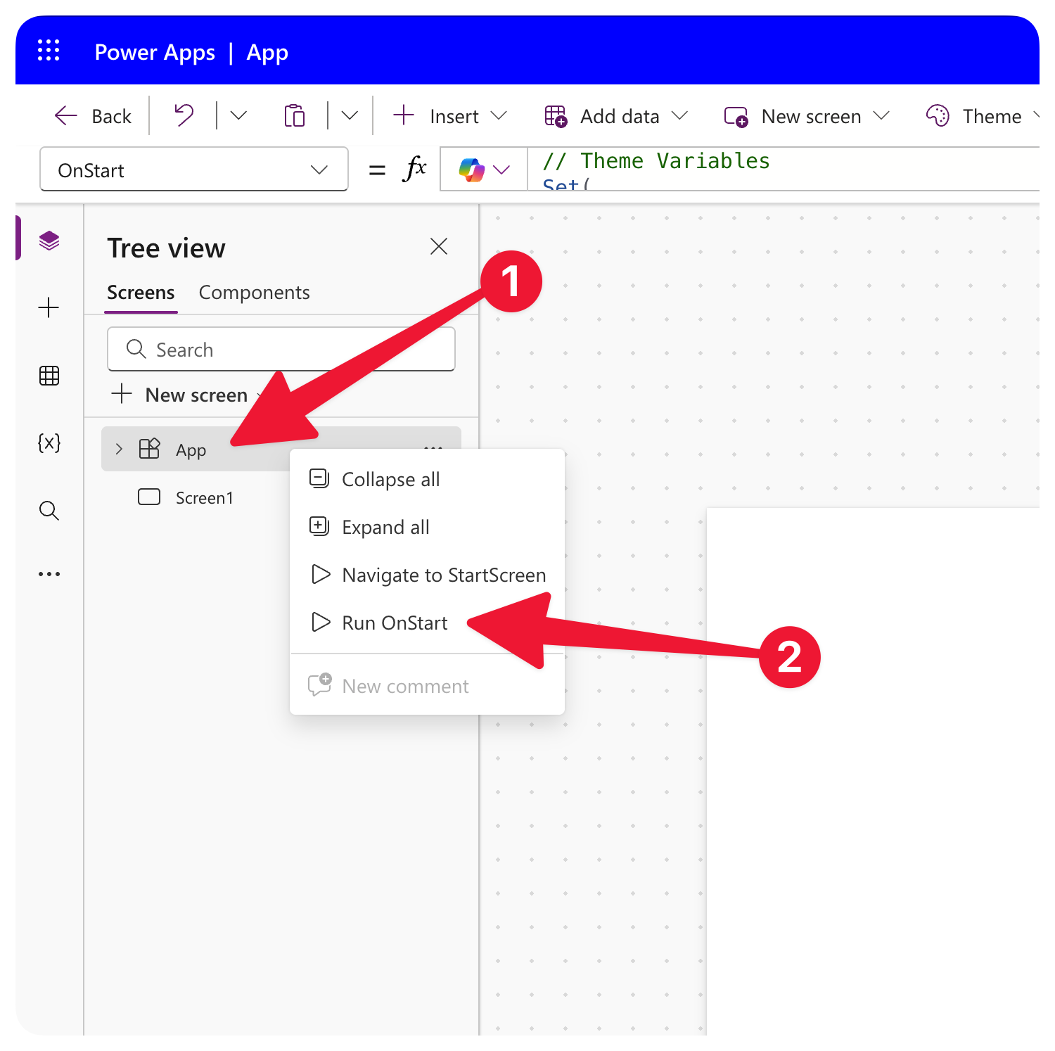
After adding OnStart code, you need to run it once. Right-click on App in the Tree view and select "Run OnStart".
Step 6: Done!
Your app now has working dark mode. Click the theme toggle button in the header to switch between light and dark.
The Manual Way: Add Dark Mode to Any App
If you want to add dark mode to an existing app or build it yourself, here's how.
Step 1: Create Theme Variables
Add these variables to your App.OnStart:
// Theme toggle (false = light, true = dark)
Set(varDarkMode, false);

// Background colors
Set(varBgPrimary, If(varDarkMode, "#0f172a", "#ffffff"));
Set(varBgSecondary, If(varDarkMode, "#1e293b", "#f1f5f9"));

// Text colors
Set(varTextPrimary, If(varDarkMode, "#f8fafc", "#0f172a"));
Set(varTextSecondary, If(varDarkMode, "#94a3b8", "#64748b"));

// Accent color (same for both themes usually)
Set(varAccentColor, "#3b82f6");
Step 2: Create a Toggle Button
Add a button or icon that toggles the theme:
// OnSelect property of your toggle button
Set(varDarkMode, !varDarkMode);

// Re-run the color assignments
Set(varBgPrimary, If(varDarkMode, "#0f172a", "#ffffff"));
Set(varBgSecondary, If(varDarkMode, "#1e293b", "#f1f5f9"));
Set(varTextPrimary, If(varDarkMode, "#f8fafc", "#0f172a"));
Set(varTextSecondary, If(varDarkMode, "#94a3b8", "#64748b"));
Step 3: Apply Variables to Your Components
Instead of hardcoding colors, use your variables:
| Property | Use This |
|---|---|
| Screen Fill | varBgPrimary |
| Card Fill | varBgSecondary |
| Text Color | varTextPrimary |
| Subtle Text | varTextSecondary |
| Button Color | varAccentColor |
For example, set your screen's Fill property to:
varBgPrimary
And text labels' Color property to:
varTextPrimary
Step 4: Test It
Click your toggle button. All components using the variables will switch colors instantly.
Tips for Better Dark Mode
Use Sufficient Contrast
Dark mode isn't just "invert everything". Make sure:
- Text is easily readable against backgrounds
- Interactive elements stand out
- Don't use pure black (
#000000) - use dark grays like#0f172a
Don't Forget Borders
In light mode, you might have subtle gray borders. In dark mode, you'll need lighter borders:
Set(varBorderColor, If(varDarkMode, "#334155", "#e2e8f0"));
Consider Images and Icons
Icons and images might need adjustment:
- SVG icons can have their colors changed with formulas
- For images, consider having dark/light variants
- Or use a slight overlay to reduce brightness in dark mode
Next Steps
Now that you have dark mode working:
- Add more screens - They'll all use your theme variables
- Customize the colors - Adjust the hex values to match your brand
- Save user preference - Use
SaveData()to remember the user's choice
Want a complete app layout with dark mode already built in? Check out the App Shell components - they include navigation, headers, and theme switching all ready to go.
Related Components
- App Shells - Six app frames, each with a theme switch built in
- Navigation Bars - Headers for your app
Have questions about this tutorial? Send feedback and I'll help you out.